How to Add Icons to a Custom Card Component in React Native
Learn how to add and customize icons with this step-by-step guide and make your React Native card component look even more awesome.
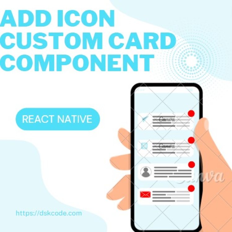
Table Of Content
I. Introduction
A. Purpose
B. Overview
II. Setting Up the Card Component
A. Importing the Component
B. Setting the Card Styling
III. Adding Icons
A. Choosing Appropriate Icons
B. Installing React-Native-Vector-Icons
C. Importing the Icon Component
D. Adding Icons to the Card Component
IV. Conclusion
A. Summary
I. Introduction
A. Purpose
The purpose of adding icons to a custom card component in React Native is to help enhance the visual appeal of the card and to make it easier for users to identify different elements on the card. Icons can be used to convey information quickly and clearly, such as a "play" icon to indicate that the content on the card can be interactive. Additionally, they can help draw attention to important information or features on the card and make it easier for users to navigate.
B. Overview
Adding an icon to a custom card component in React Native is a simple process that involves installing a library, importing the icon, and adding it to the card’s UI. The library that developers typically use for adding icons to React Native apps is React Native Vector Icons. After installing the library, developers can import the desired icon, add it to their component, and customize it to their needs. Finally, they can use the <Icon /> component to add the icon to the card.
II. Setting Up the Card Component
1. Create a new file for your Card component, such as 'Card.js'.
2. Import the necessary components from React Native
import { View, Text, StyleSheet } from 'react-native';
3. Create the Card component class, and add a render method that returns some JSX.
render() {
return (
<View style={styles.container}>
<Text>Hello from the Card component!</Text>
</View>
);
}
}
4. Style your component with a StyleSheet.
container: {
flex: 1,
alignItems: 'center',
justifyContent: 'center',
padding: 20,
},
});
5. Export your component.
III. Adding Icons
1. Install the react-native-vector-icons package.
2. Link the package to your project
3. Add the icon to your project
4. Use the Icon component to render the icon:
Adding Icons to the Card Component
Add the icon to the custom card component
Now that we have imported the "Icon" component, we can add it to our custom card component. Open the "Card.js" file and update the "Card" component as follows:
card: {
backgroundColor: '#ffffff',
borderRadius: 10,
elevation: 5,
padding: 20,
marginVertical: 10,
marginHorizontal: 20,
shadowColor: '#000000',
shadowOpacity: 0.3,
shadowRadius: 5,
shadowOffset: {
width: 0,
height: 3
}
},
icon: {
position: 'absolute',
top: 10,
left: 10
}
});
Here, we have added the "Icon" component to the "Card" component. The "name" prop of the "Icon" component takes the name of the icon that you want to use. The "size" prop specifies the size of the icon, and the "color" prop specifies the color of the icon.
We have also added some styles to position the icon at the top-left corner of the card.
Use the custom card component with an icon
Now, we can use the custom card component with an icon in our app. Open the "App.js" file and update the code as follows:
import { View, Text } from 'react-native';
import Card from './Card';
const App = () => {
return (
<View>
<Card iconName="rocket">
<Text>Card 1</Text>
</Card>
<Card iconName="book">
<Text>Card 2</Text>
</Card>
<Card iconName="user">
<Text>Card 3</Text>
</Card>
</View^gt;
);
}
export default App;
Run your app
Finally, run your app using the following command:
This will start the React Native development server and launch your app in the Android emulator.
IV. Conclusion
Adding an icon to a custom card component in React Native requires a few steps. First, create a custom card component that contains the necessary elements, such as a title, body, and icon. You will also need to import the React Native Vector Icons package, which provides access to a variety of icons.
Next, create a style for the card component to make sure it looks the way you want, such as setting a width and height, border radius, padding, and background color. Then, add a TouchableOpacity component to the card, which will allow users to interact with the icon
Finally, add an Icon component to the card and set its name, color, size, and style. You can also add a function to the onPress prop of the TouchableOpacity component, which will be invoked when the user taps the icon. This function can be used to perform any action, such as navigating to a different page or displaying an alert.
By following these steps, you can successfully add an icon to a custom card component in React Native.


