Creating a Custom Card Component in React Native
This tutorial will teach you how to create a custom card component in React Native. You will learn about the different components that make up a card and how to style them. We will also discuss how to create a reusable component that can be used in multiple projects.
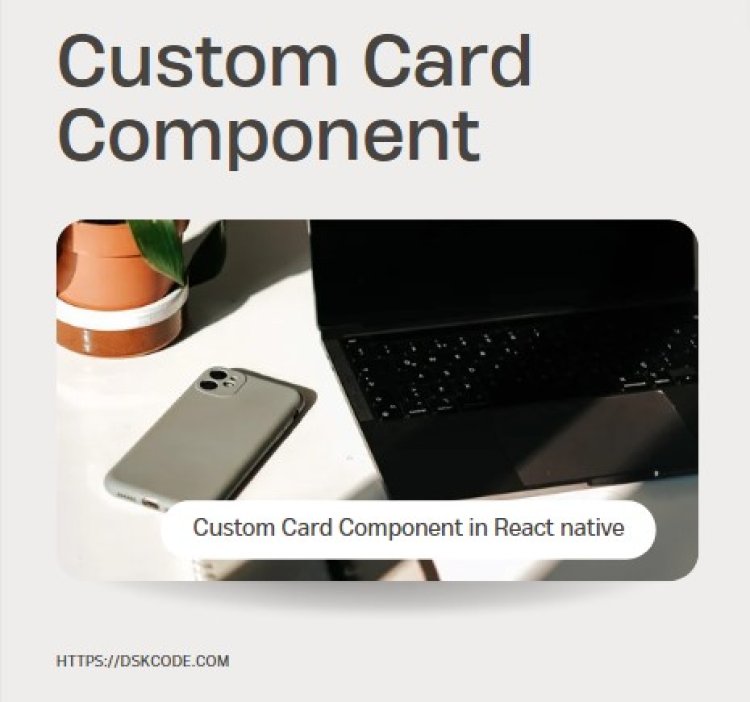
Table Of Content
I. Introduction
A. What is a Custom Card Component?
B. Benefits of Using a Custom Card Component
II. How to Create a Custom Card Component
A. Setting Up Your Project
B. Designing the Component
C. Writing the Code
III. Customizing Your Component
A. Adding Icons
C. Adding Text
IV. Conclusion
A. Recap of How to Create a Custom Card Component
B. Benefits of Using a Custom Card Component
I. Introduction
A. What is a Custom Card Component?
A custom card component in React Native is a reusable UI element that can be used to display information such as images, text, and more. It is usually a combination of different UI components such as Image, Text, Button, View, and other components to create an attractive and interactive card. It is a great way to add visual interest to an app and make it easier to understand and navigate.
B. Benefits of Using a Custom Card Component
1. Improved accessibility: By using a custom card component, you can ensure that users who are visually impaired or have difficulty using a mouse can easily access the content of your website. This can be done by using larger fonts, better contrast, and other accessibility features.
2. Increased consistency: By using a custom card component, you can ensure that the design of your website is consistent throughout, making it easier for users to navigate and find what they need.
3. Improved usability: A custom card component can help make your website more user-friendly by making it easier for users to find what they need. By using a consistent design, users can quickly identify the different sections of your website.
4. Better performance: By using a custom card component, you can ensure that your website loads quickly and efficiently. This can help improve the user experience and the overall performance of your website.
II. How to Create a Custom Card Component
Step 1: Setup your React Native project
To start with, you will need to have Node.js and React Native installed on your system. If you haven’t installed them yet, follow the official documentation for the installation process.
Once you have installed React Native, create a new project by running the following command:
This will create a new project with the name "CustomCardComponent".
Step 2: Create a custom card component
In your project directory, create a new file called "Card.js". This file will contain the code for our custom card component.
import { View, StyleSheet } from 'react-native';
const Card = (props) => {
return (
<View style={styles.card}>
{props.children}
</View>
);
}
const styles = StyleSheet.create({
card: {
backgroundColor: '#ffffff',
borderRadius: 10,
elevation: 5,
padding: 20,
marginVertical: 10,
marginHorizontal: 20,
shadowColor: '#000000',
shadowOpacity: 0.3,
shadowRadius: 5,
shadowOffset: {
width: 0,
height: 3
}
});
export default Card;
Here, we have defined our custom card component called "Card". The component takes in a prop called "children", which is a special prop in React that is used to render any content between the opening and closing tags of a component.
The component is a simple View component with some custom styles. We have added a white background color, border radius, and elevation to create a shadow effect. We have also added some padding and margins to make the component look like a card.
Step 3: Use the custom card component
Now that we have created our custom card component, let’s use it in our app. Open the App.js file in your project directory and replace the existing code with the following:
import { View, Text } from 'react-native';
import Card from './Card';
const App = () => {
return (
<View>
<Card>
<Text>Card 1</Text>
</Card>
<Card>
<Text>Card 2</Text>
</Card>
<Card>
<Text>Card 3</Text>
</Card>
</View>
);
}
export default App;
Here, we have imported our custom card component and used it to wrap some text elements. We have created three cards with some text content, but you can replace the text with any content that you want to display in your card component.
Step 4: Run your app
Finally, run your app using the following command:
This will start the React Native development server and launch your app in the Android emulator.
III. Customizing Your Component
A. Adding Icons
C. Adding Text
IV. Conclusion
A. Recap of How to Create a Custom Card Component
1.Create a new component file, importing the required modules from React Native such as View, Text, StyleSheet, and Image.
2.Create a functional component with any props that you will be using in the card.
3.Create a const variable to hold the styles of your component.
4.Create a View component and nest any other components you will be using inside it.
5.Create a Text component for any text you will be displaying in the card.
6.Create an Image component for any images you will be displaying in the card.
7.Add a background color and any other styling to the View component.
8.Add styling to the Text component.
9.Add styling to the Image component.
10.Pass the props to the component to use in the styling or other components.
11.Export the component to use in other files.
B. Benefits of Using a Custom Card Component
Increased Performance: Using a custom card component can result in improved performance due to the fact that it is specifically tailored to the specific requirements of the application. This allows for more efficient code execution and improved user experience.
Improved Flexibility: When using a custom card component, developers are able to create a unique design and layout that is tailored to their specific needs. This allows for more flexibility in the design and layout of the card component, which makes it easier to change the design and layout as needed.
Reusability: Custom card components can be reused in multiple applications, making it easier to reuse code and implement new features. This makes the development process more efficient and cost effective.
Easy Integration: Custom card components are usually easy to integrate into existing applications, allowing developers to quickly add new features and functionality without having to rewrite the entire application.
Improved Security: Custom card components are designed with security in mind, providing a more secure environment for data and reducing the risk of data breaches.


