Enhance User Input with React Native Range Slider
Empower your users to select values with ease. Integrate our Range Slider to Your App Today
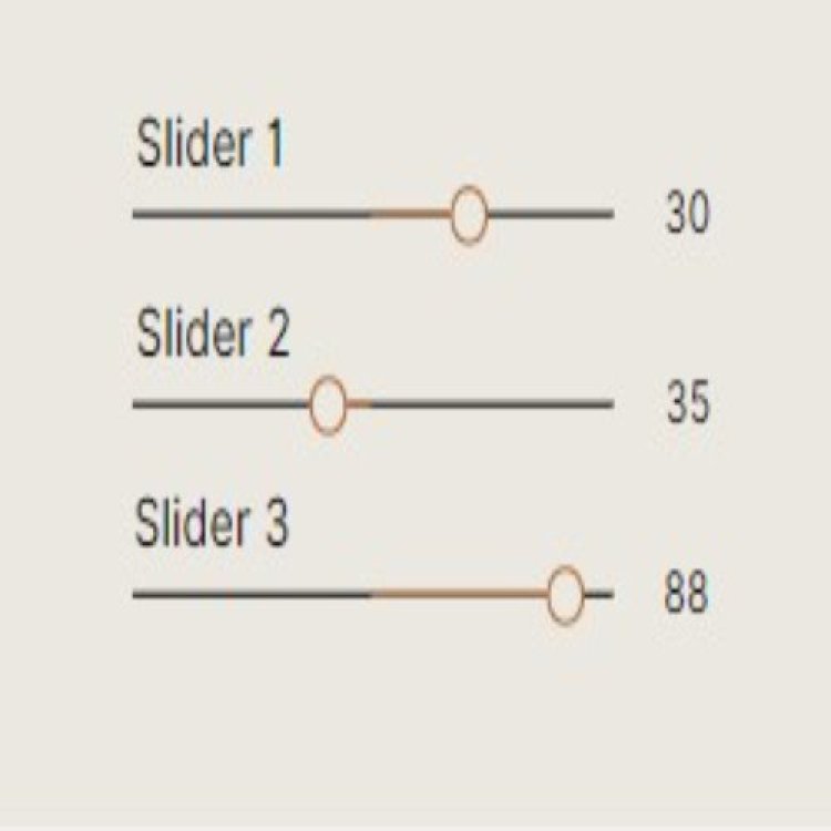
Table Of Content
I. Introduction to React Native Range Slider
II. React Native Range Slider Usage
III. Advantages of Using React Native Range Slider
IV. Overview of React Native Range Slider Features
V. Conclusion regarding React Native Range Slider
Introduction to React Native Range Slider
A range slider is a UI component that allows users to select a range of values within a given interval. React Native, a popular mobile app development framework, offers a range of pre-built components, including a range slider, that can be easily integrated into your app. The React Native range slider component is highly customizable and can be styled to match the look and feel of your app. With its intuitive interface and smooth user experience, the React Native range slider is a great option for developers looking to enhance their mobile app's functionality. Whether you're building a fitness app, a finance app, or any other type of app that requires user input, the React Native range slider can help you create a more engaging and interactive user experience.
React Native Range Slider Usage
- Open your React Native project in a code editor, such as Visual Studio Code or Sublime Text.
- Open a terminal window and navigate to the root directory of your React Native project.
- Install the React Native slider library using npm (Node Package Manager) by running the following command in the terminal:
npm install @react-native-community/slider --save
This command installs the necessary library for the range slider component and saves it as a dependency in your project's package.json file. - Open the file where you want to add the range slider component. For this example, we'll create a new screen called RangeSliderScreen.js.
- Import the Slider component from the React Native slider library by adding the following import statement at the top of the file:
import Slider from '@react-native-community/slider';
This imports the Slider component from the library and makes it available for use in the file. - Create a state variable for the selected value of the range slider. You can do this using the useState hook from React, like this:
const [sliderValue, setSliderValue] = useState(50);
This sets the initial value of the sliderValue state variable to 50 and creates a function setSliderValue that can be used to update the value of sliderValue. - Add the Slider component to the screen, passing in the necessary props to customize its appearance and behavior. For example, to create a basic range slider with a minimum value of 0, a maximum value of 100, and an initial value of 50, you might use the following code:
<Slider
minimumValue={0}
maximumValue={100}
value={sliderValue}
onValueChange={(value) => setSliderValue(value)}
/>
- The minimumValue prop sets the minimum value of the range slider.
- The maximumValue prop sets the maximum value of the range slider.
- The value prop sets the initial value of the range slider based on the sliderValue state variable.
- The onValueChange prop sets a callback function that is called whenever the user moves the slider is function updates the sliderValue state variable to the current value of the slider.
- Render the current value of the range slider on the screen by adding a text component below the Slider. For example:
- This displays the current value of the range slider on the screen, updating automatically as the user moves the slider.
- Save your changes and run your app to test the react native range slider. You should see a basic range slider with an initial value of 50 that can be moved to select a value between 0 and 100.
This is just a basic example of how to implement a React Native range slider. You can customize the appearance, behavior, and functionality of the range slider by passing in additional props and adding additional logic to handle user interactions.
Advantages of Using React Native Range Slider
- Easy to use:
The React Native range slider is easy to use and implement in your mobile app, as it comes with a set of pre-built components and options that make customization simple.
- Customizable:
React Native range slider is highly customizable, allowing you to set the slider's minimum and maximum values, step value, color, and other properties to fit your app's specific needs.
- Consistent look and feel:
React Native range slider follows the Material Design guidelines, ensuring that it maintains a consistent look and feel with other native components in your app.
- Improved user experience:
Range sliders are a user-friendly way of selecting a value within a range, and implementing it in your mobile app can enhance the user experience, especially in scenarios where precise value selection is required.
- Better accessibility:
Range sliders provide better accessibility compared to other input methods, as they allow users with limited motor skills to make selections easily.
- Cross-platform support:
React Native range slider is a cross-platform solution that works on both Android and iOS devices, reducing the need for platform-specific code and testing.
- Saves development time:
Using pre-built components like the React Native range slider can save development time, allowing developers to focus on other aspects of their mobile app.
Overview of React Native Range Slider Features
- Customizable appearance:
React Native range slider provides a range of props that allow you to customize the slider's appearance, including color, width, height, and thumb icon.
- Range selection:
The range slider allows users to select a value within a range, rather than a single value like a typical slider.
- Precise selection:
Range sliders allow for precise selection of a value within a range, with the ability to specify the minimum and maximum values and step value.
- Accessibility:
The React Native range slider is accessible to users with limited motor skills, as it provides an easy way to make selections within a range.
- Cross-platform support:
The range slider works on both Android and iOS devices, making it a cross-platform solution.
- Support for callback functions:
React Native range slider provides callback functions that allow developers to listen for value changes and take action based on those changes.
- Built-in animation:
The range slider has built-in animation that provides a smooth and responsive user experience.
- Easy to use:
The React Native range slider is easy to use, with a set of pre-built components and options that make customization simple.
- Consistent design:
The range slider follows the Material Design guidelines, ensuring that it maintains a consistent look and feel with other native components in your app.
- Performance optimization:
React Native range slider is optimized for performance, ensuring that it works smoothly and quickly on both Android and iOS devices.
Conclusion regarding React Native Range Slider
The React Native framework offers developers a wide range of pre-built UI components, including a range slider, that can be easily incorporated into their mobile applications. The React Native range slider is a customizable and versatile component that enables users to select a range of values within a specified interval. Its intuitive interface and seamless user experience make it a popular choice for developers across various domains, including fitness and finance applications. By integrating the React Native range slider into your mobile app, you can create a more interactive and engaging user experience that empowers your users to provide input with ease.
Example Program
Import the Slider component from the @react-native-community/slider package:
import { StyleSheet, Text, View } from 'react-native';
import Slider from '@react-native-community/slider';
Create a component and define a state variable to store the selected value of the range slider:
const [value, setValue] = useState(0);
return (
<View style={styles.container}>
<Text style={styles.label}>{value}</Text>
<Slider
style={styles.slider}
minimumValue={0}
maximumValue={100}
minimumTrackTintColor="#FF0000"
maximumTrackTintColor="#000000"
onValueChange={setValue}
step={1}
/>
</View>
);
}
Add a label to display the selected value of the range slider:
Define styles for the container, slider, and label:
container: {
flex: 1,
alignItems: 'center',
justifyContent: 'center',
},
slider: {
width: 300,
height: 40,
},
label: {
fontSize: 20,
fontWeight: 'bold',
marginVertical: 10,
},
});
Run the IOS app
Run the Android app


